Accessible Color Use and Color Contrast
Color can be used to depict information with clarity, but certain best practices should be followed to ensure effective and inclusive use of color on text and graphics.
Color Contrast
For “normal” text, there should be a minimum of 4.5:1 contrast ratio between text foreground and background colors. For large text (18pt or larger) or bold text, the minimum contrast ratio requirement is 3:1.
Good Color Contrast:
This is black text (Hex: #000000) on this light grey (Hex: #D9D9D9) is a good example of good color contrast. The contrast ratio for this example is 14.9:1
This black text (Hex: #000000) on this green background (Hex: #38761D) is not a good example of good color contrast. The contrast ratio for this example is 3.8:1.
Color Contrast Tools
There are many different tools available to check for proper color contrast ratios including:
- WebAIM’s Color Contrast Checker
- The Paciello Group’s Colour Contrast Analyser
- Accessible U’s Color Contrast Analyzer Chrome Extension
Color to Convey Information
Color should not be your only method of conveying important information. Use color in conjunction with an additional way to denote important information. Individuals with certain types of color-blindness may not be able to understand important information if meaning is conveyed only with color.
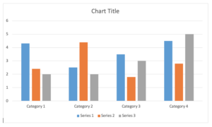
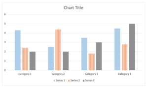
When creating a chart, use color and pattern to denote different chart sections. Example 1 only color to differentiate between column, but Example 2, uses color and pattern.
Example 1 – Color Only:
Example 2 – Color and Pattern:
Other Best Practices
- Avoid meaningful use of red, green, or colors that are rich in red or green hues, because they can be difficult to distinguish for people with deuteranopia or protanopia.
- Avoid the use of black text on red background or red text on black background (some colorblind people cannot see lower color wave frequencies that are associated with red, so red appears black)


